Marketing automation is a powerful tool that can both reduce your workload and bring about quick results. But even if your marketing automation runs like a well-oiled machine, regularly sending off polished emails and epic social media posts — and thusly, inspiring users to visit your site — you still might fail in your conversion goals.

We know. You feel like you’re spinning your wheels. But you’re not.
Marketing automation will help you achieve your ultimate goal faster — to get your website visitors to do exactly what you want them to do (subscribe to your newsletter, download your whitepaper, sign-up for your webinar, or… we don’t know… BUY YOUR PRODUCT).
But, alas, marketing automation is not enough. You need a website that’s optimized and both ready and willing to convert your leads.
Why do they leave you before they convert?
There are three main reasons your website may unwittingly sabotage your marketing automation efforts, and therefore, your bottom line… conversion.
- It’s too slow
- It offers poor UX/UI
- Your forms stink
First, let’s understand the whys, and then afterward, we’ll tackle how to fix these issues so you can convert like a champ.
1. No Patience for The Snail. Channel the Cheetah.
Your potential clients are impatient. They’re bouncing from one site to another, and if things don’t load fast enough, you and your company are gone.
But why? You just spent thousands of dollars on a new website with all the bells and whistles!

Stop whining. While we remember the days where we were comfortable waiting nearly a week for the next Netflix DVD to arrive in the snail mail, we are now the same people who get insanely frustrated when it takes us ten minutes to download a movie. Times have changed. Change with them.
Google found that as mobile page load time goes from one second to 10 seconds, the probability of a mobile site visitor bouncing increases 123%!
Pingdom found similar results. The average bounce rate for pages loading within two seconds was nine percent. As soon as the page load time surpassed three seconds, the bounce rate soared, and by five seconds, it hit 38%.
Your clever emails may get your prospect to the site, but if your site loads in true snail form, you will lose that hard-won lead. Every. Darn. Time.
Websites load slowly for several reasons including:
- The quality of the user’s desktop browser and private network
- The quality of their mobile device and network
- The quality of your web hosting provider
- The amount of content on your webpage
The first two issues are not in your control. But choosing the right web hosting provider and optimizing your website content is within your control and can be improved.
A web hosting provider can speed up your website if it includes certain features like:
1. A Content Delivery Network (CDN)
If you run a national or global business, a web hosting service that provides a CDN will enable you to distribute your content from servers located around the world. For example, if your web host’s main server is located in Texas, and your user is located in Germany, a CDN will serve it up much faster as the content is also stored in another, closer location within Europe.
2. Super cache technology
By continually saving and caching your websites, webpages, and databases, SuperCache technology improves a website’s upload speed.
3. Managed services as opposed to shared services
If your hosting plan is free or on the cheaper end of the spectrum, you’re likely sharing server space with other sites. This is probably adequate for small businesses or blogs that run few campaigns.
However, if you run frequent campaigns and expect periodic spikes in traffic as a result, your slice of the pie may not be enough to cover those spikes in traffic, resulting in crashing. And burning.
A managed hosting option with a dedicated server or a VPS (Virtual Private Server) is a better option.
1.Content that flies like the wind
Content including text, images, sounds, videos, and animations are all contributing factors to how fast your web page loads. As the volume of content increases on your page, the page speed decreases, and you will see your conversion rate drop.
Have your website developer perform an audit and begin optimizing your site in the following ways:
- Minimize the number of JavaScript and CSS files.
- Reduce the number of plugins.
- Install website caching.
By reducing some of the load, your site will automatically work faster.
2. The hot water spigot is on the wrong side
Speed is not the only factor that contributes to conversions. A poor user experience (UX) and user interface (UI) can also prevent your prospects from converting.
A website’s UI focuses on the website’s visual appearance and the point at which a user interacts with the site. Buttons, links, icons, and forms are all included in this category. When a button doesn’t bring a user to the desired destination or error messages pop up, your UI has failed.
Your site’s UX includes its UI and represents the overall experience your visitor has on your site.
Taken from another context, a good user experience and interface design mean that you can walk up to your sink faucet and get the water you need without any complications (i.e. like the hot water spigot is on the wrong side).
How’s your UX?
Ask yourself the following questions:
- Are your visitors drawn in by your branding?
- Does your content deliver on its promise?
- Can your users locate exactly what they need at the moment they need it?
- Is your site visually appealing and organized, or a cluttered mess?
- Does your website lead your visitor to a final conversion by providing the right flow?
- Do all your buttons, links, and forms work the way you intend?
You can certainly check your site to confirm that all the buttons work. But UX is subjective and derived from your target audience. To delve deeper into your UX/UI, you should conduct A/B testing. Two tools to help you test your site are:
Once you have more information, collaborate with your designer to see how you can best optimize your site’s UX/UI. Be sure to communicate the needs of your target customer and what seems to be missing in the design. Your designer will hopefully respond with creative ideas, solutions, and maybe even some quick fixes.
Once you optimize your site for UX/UI, you’ll undoubtedly see an improvement in conversions.
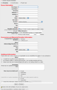
3. A treacherous path to conversion: lousy website forms

Call 1992. They want their forms back.
When you’ve read through an entire landing page, and you’ve decided to purchase a product or download a white paper, nothing is worse than these three issues:
- You can’t find the form.
- You find the form, but you’re overwhelmed by the number of entries to complete.
- You can’t get the form to process and error messages keep popping up.
Say goodbye to your lead. He’s fed up.
Forms are the point at which your lead finally converts. How well your forms function is crucial to achieving success.
A great form includes the following features:
- It is placed in a relevant spot on your site.
- It stands out on the page in terms of color and size.
- It requests only the most necessary information based on one specific goal.
- The text is concise.
- The fonts and colors match your branding.
- The send button works.
- A thank you page follows the form submission and redirects you.
Are your forms great? Use the above list to audit your site. Once you’ve adjusted your forms, you can conduct A/B testing on a platform like Optimizely.
A Beautiful Marriage: Marketing Automation and an Optimized Website
Don’t let your website sabotage your marketing automation. Audit your website for speed, UX/UI, and forms. Once you optimize these areas, you will see your conversions and your resulting ROI increase dramatically.
The post 3 Ways Your Website May Sabotage Your Marketing Automation (and How to Fix It) appeared first on Tweak Your Biz.
No comments:
Post a Comment